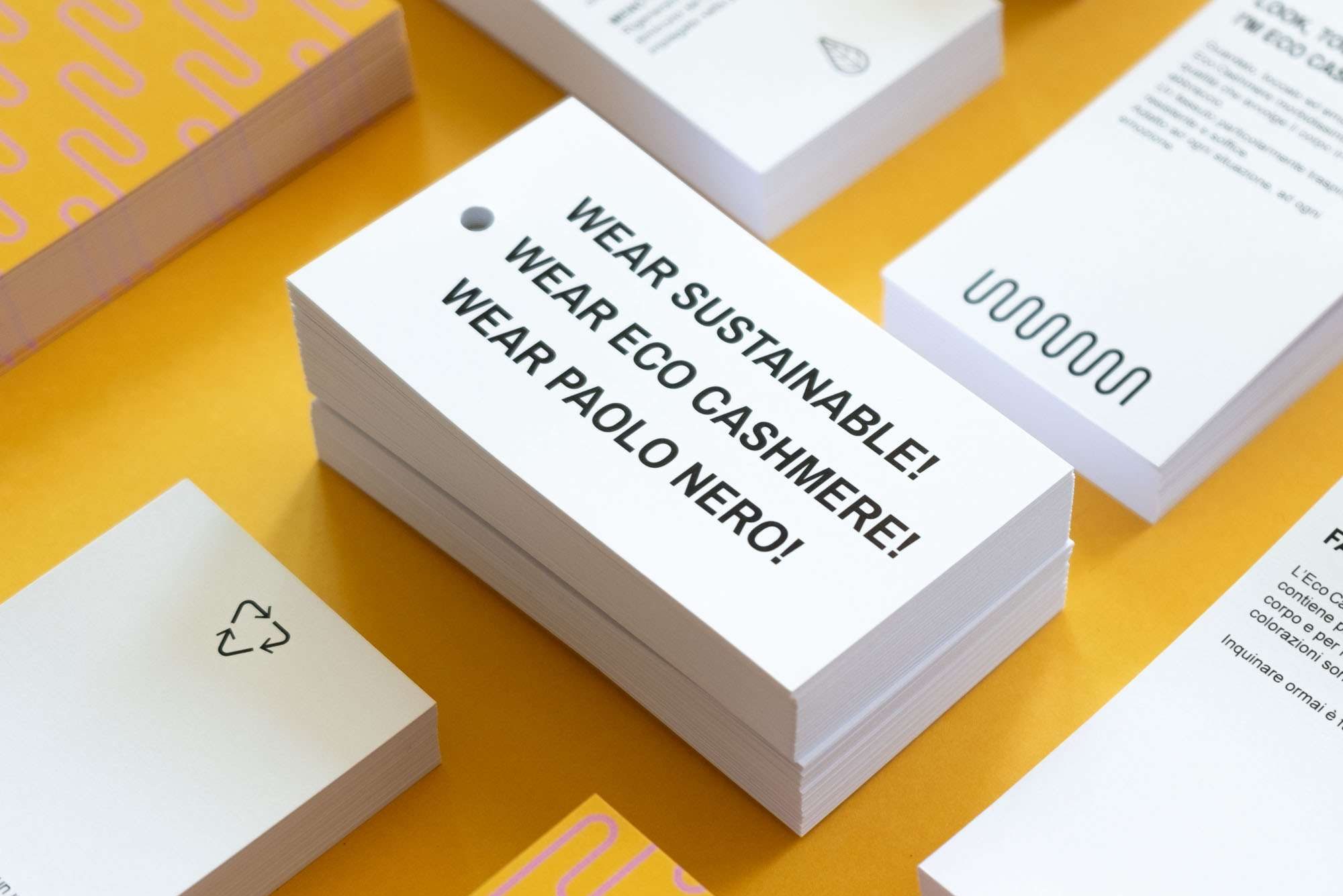
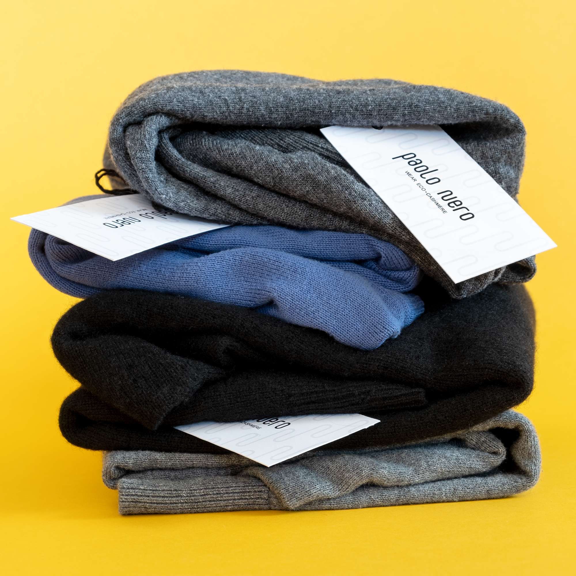
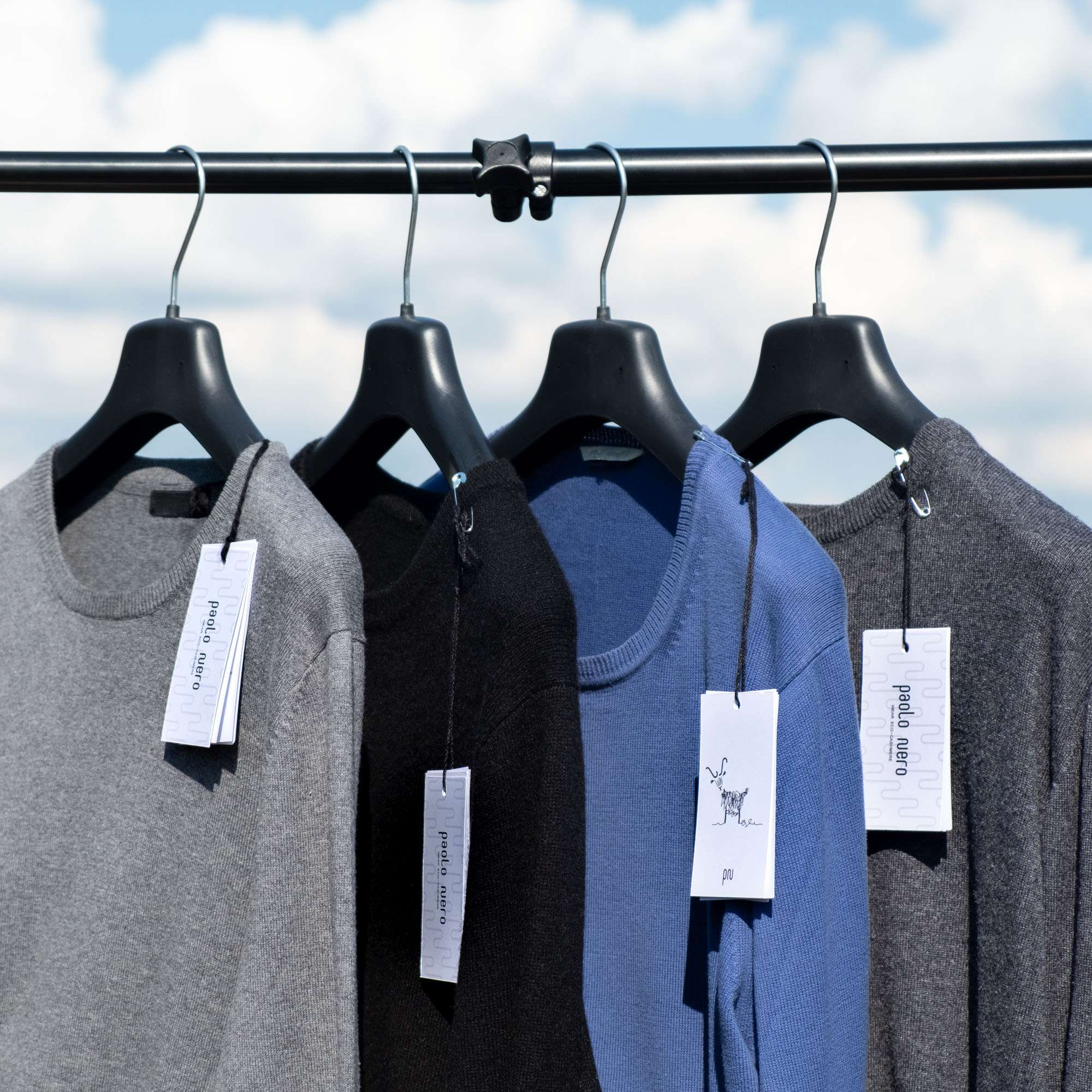
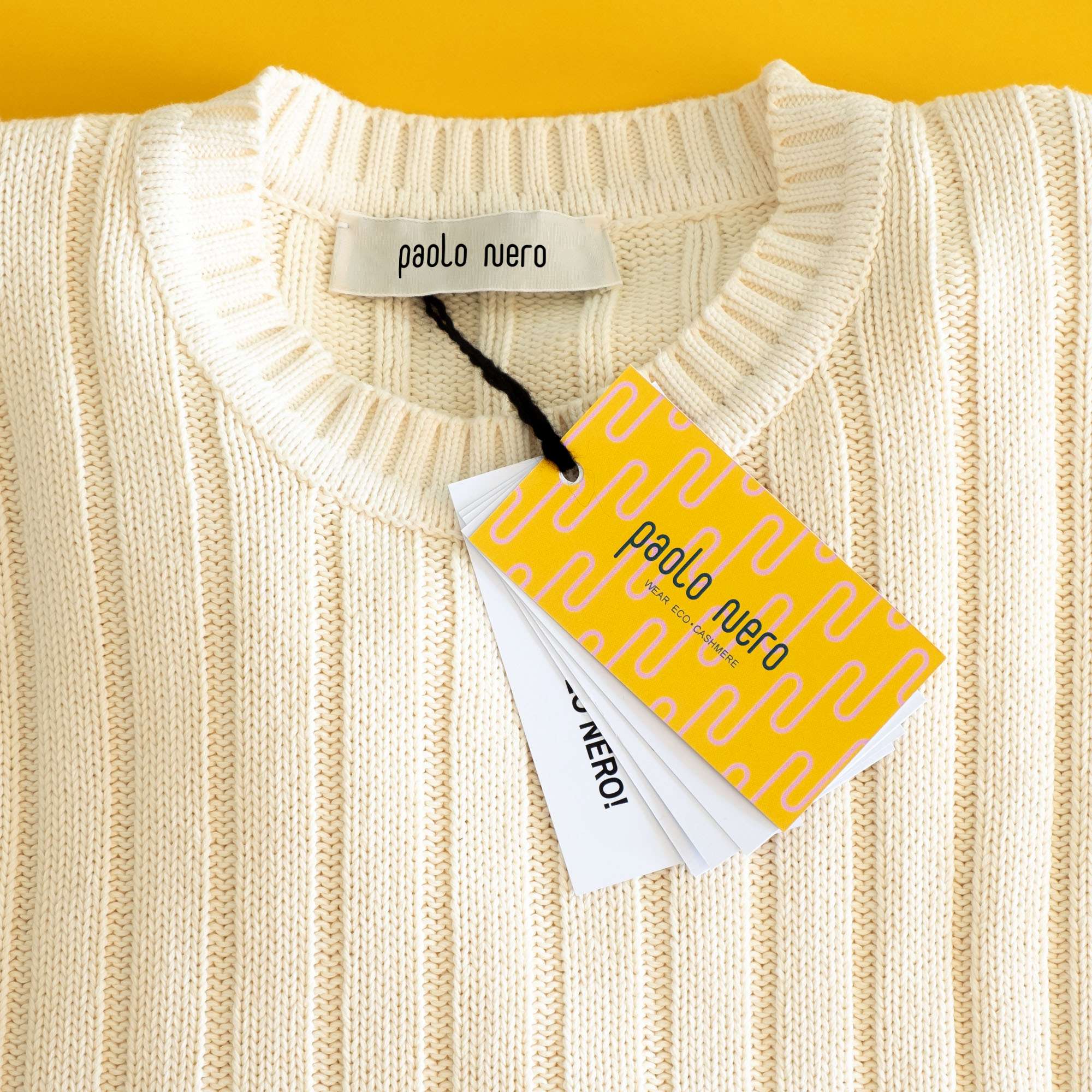
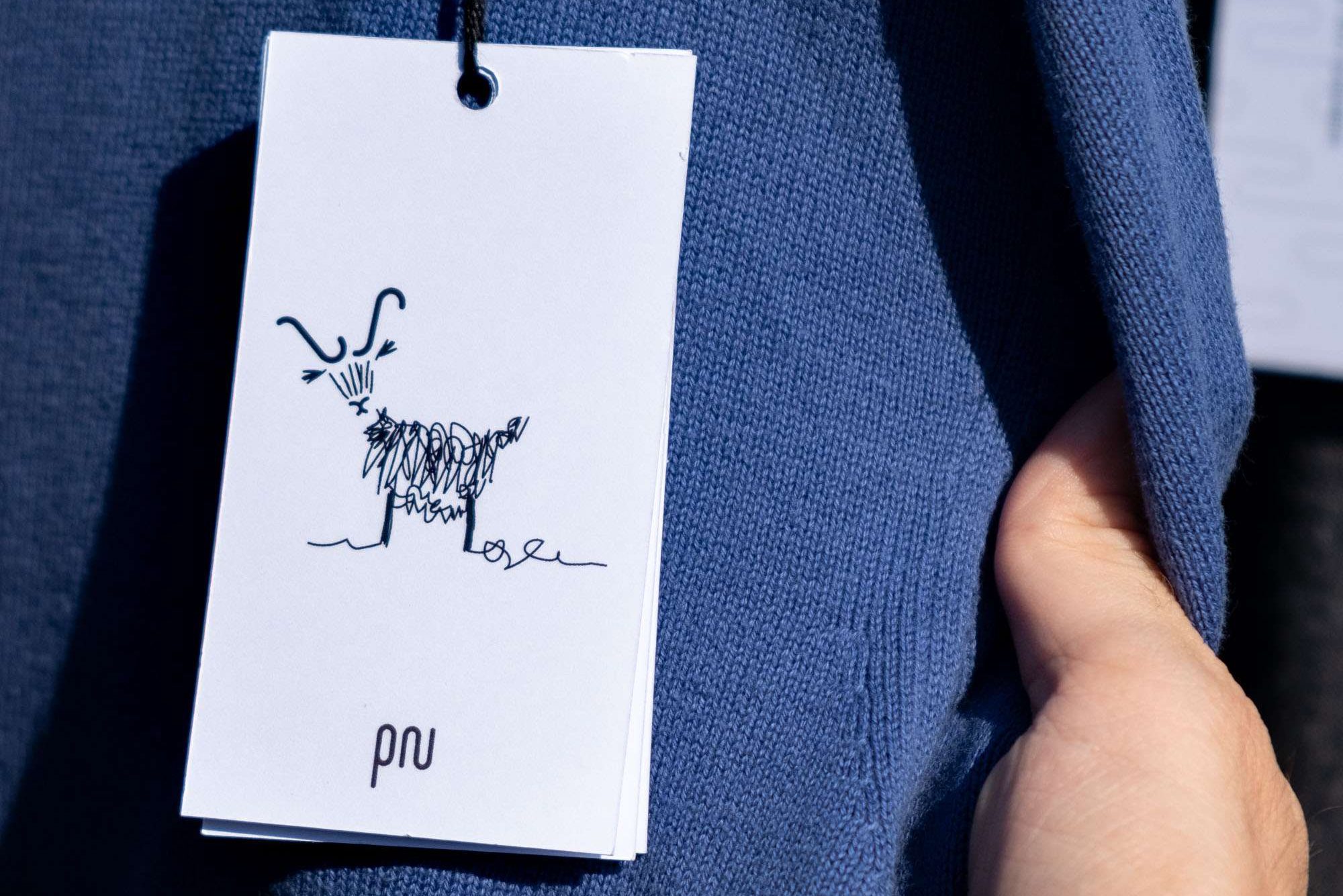
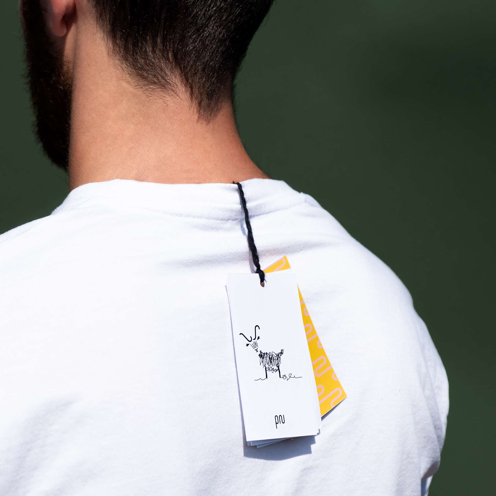
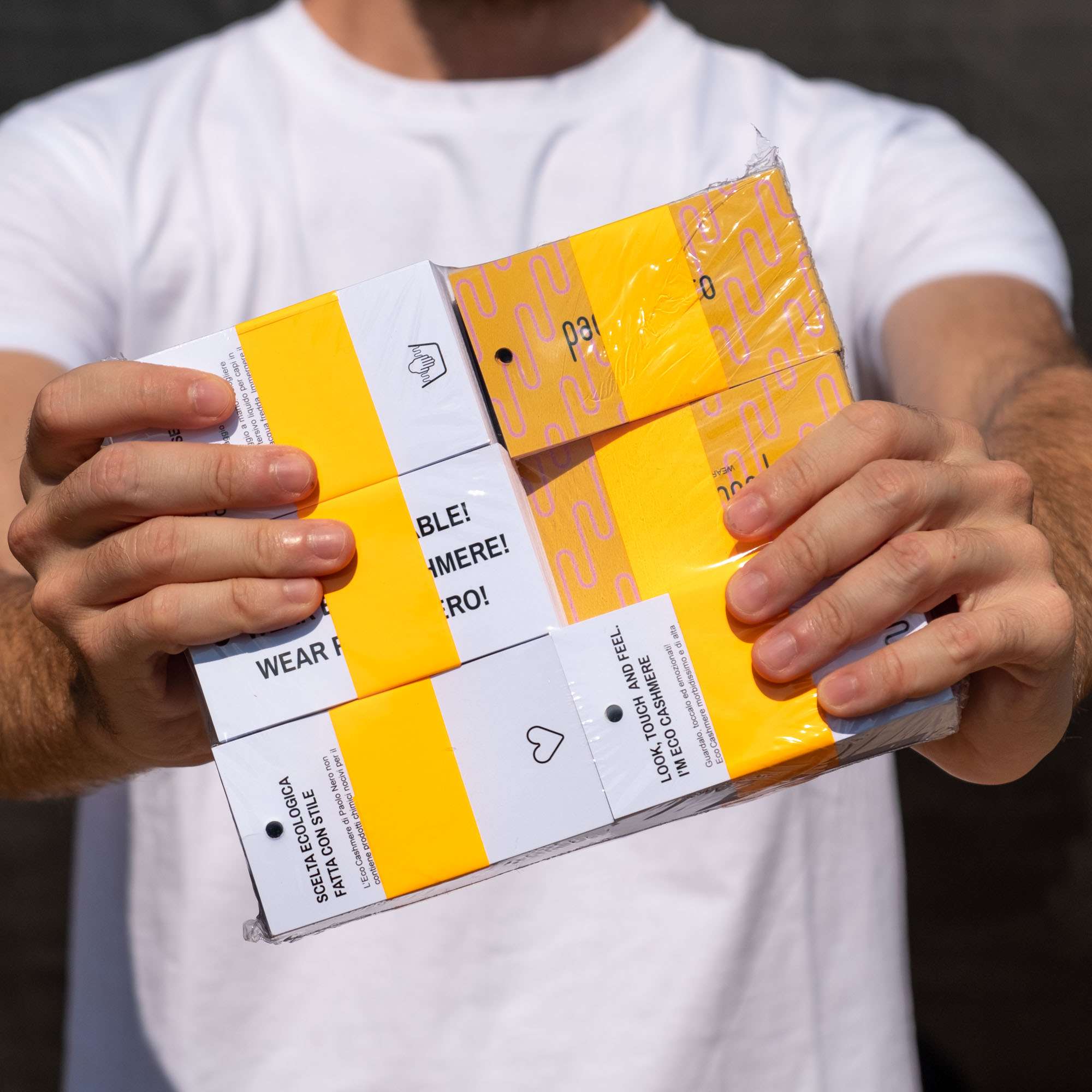
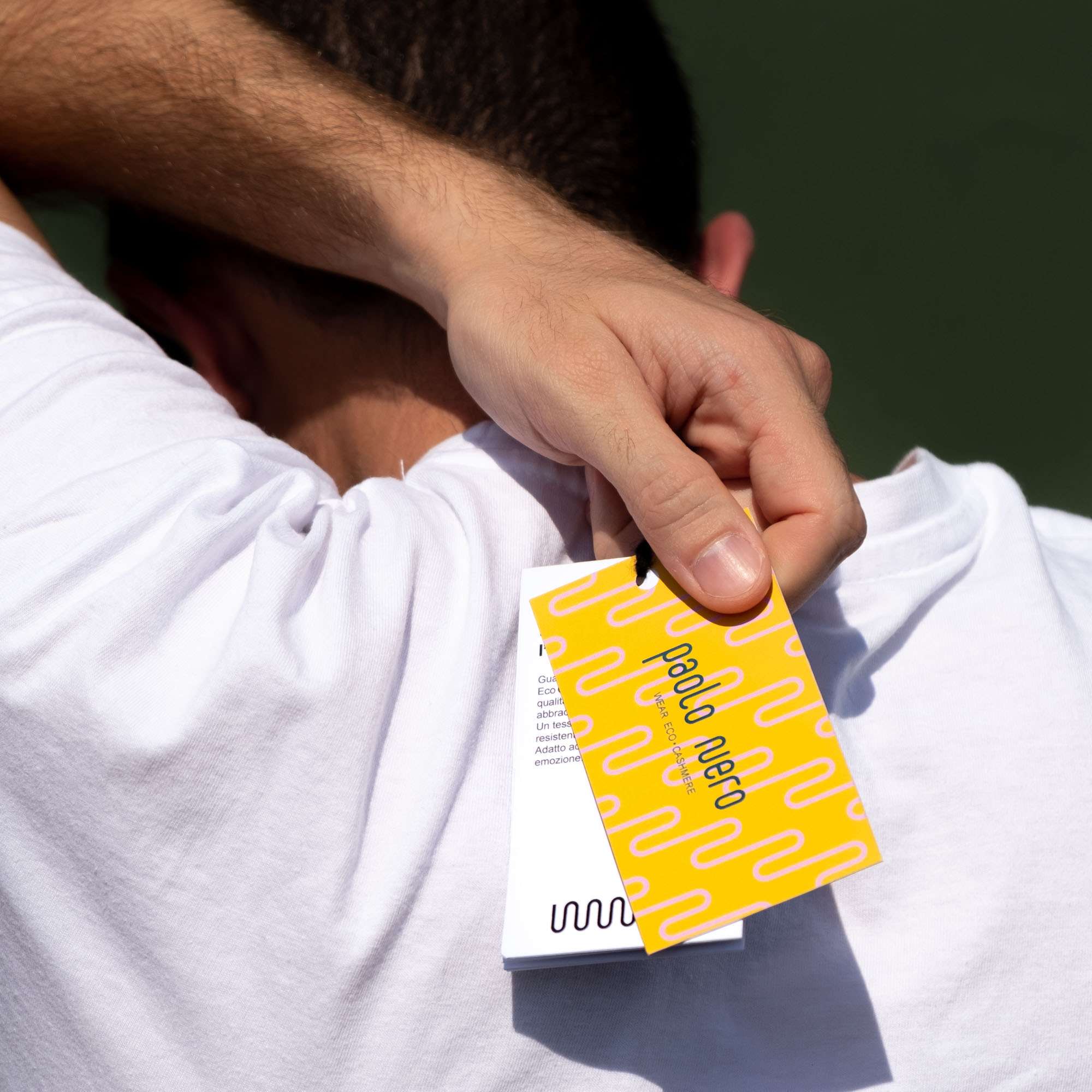
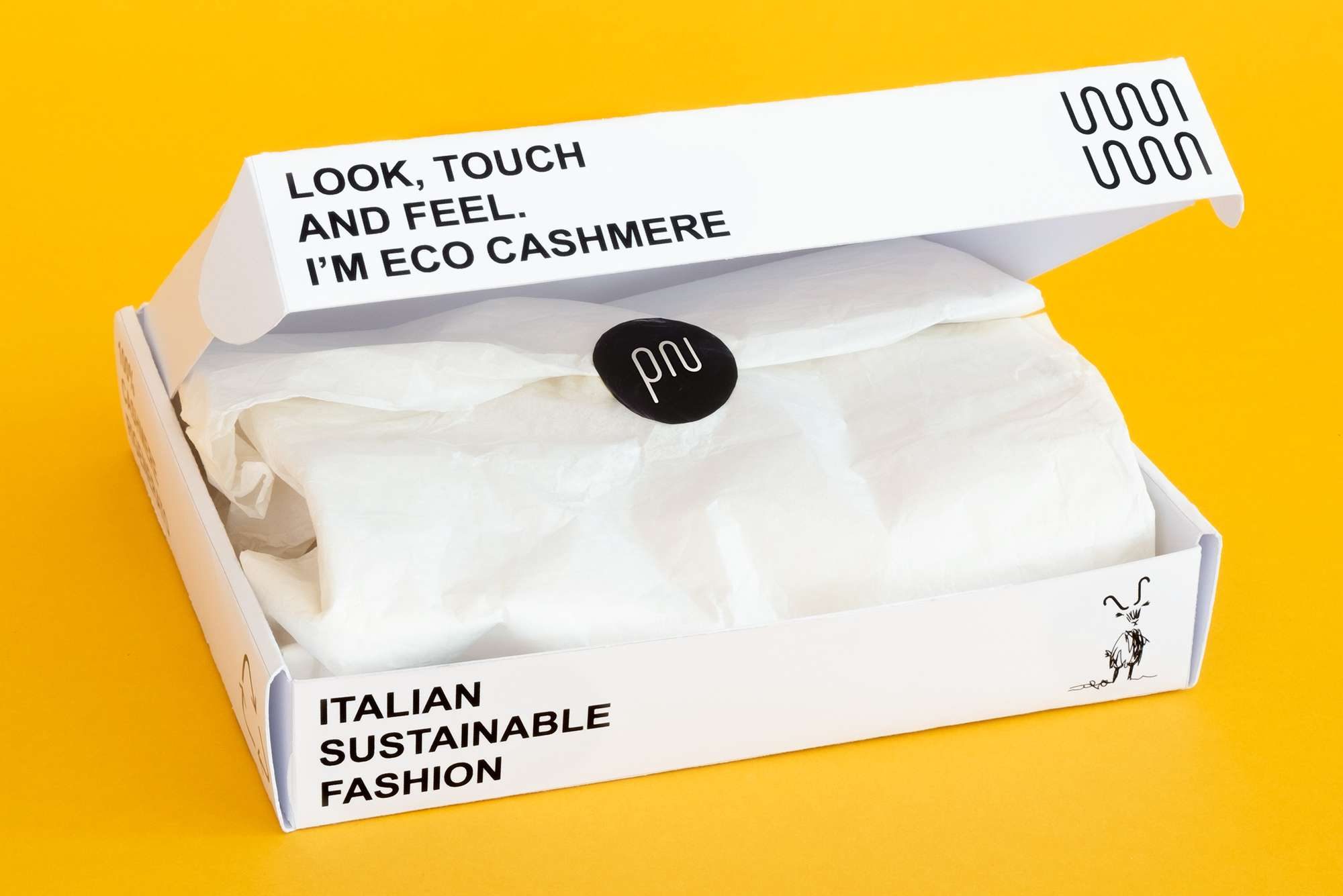
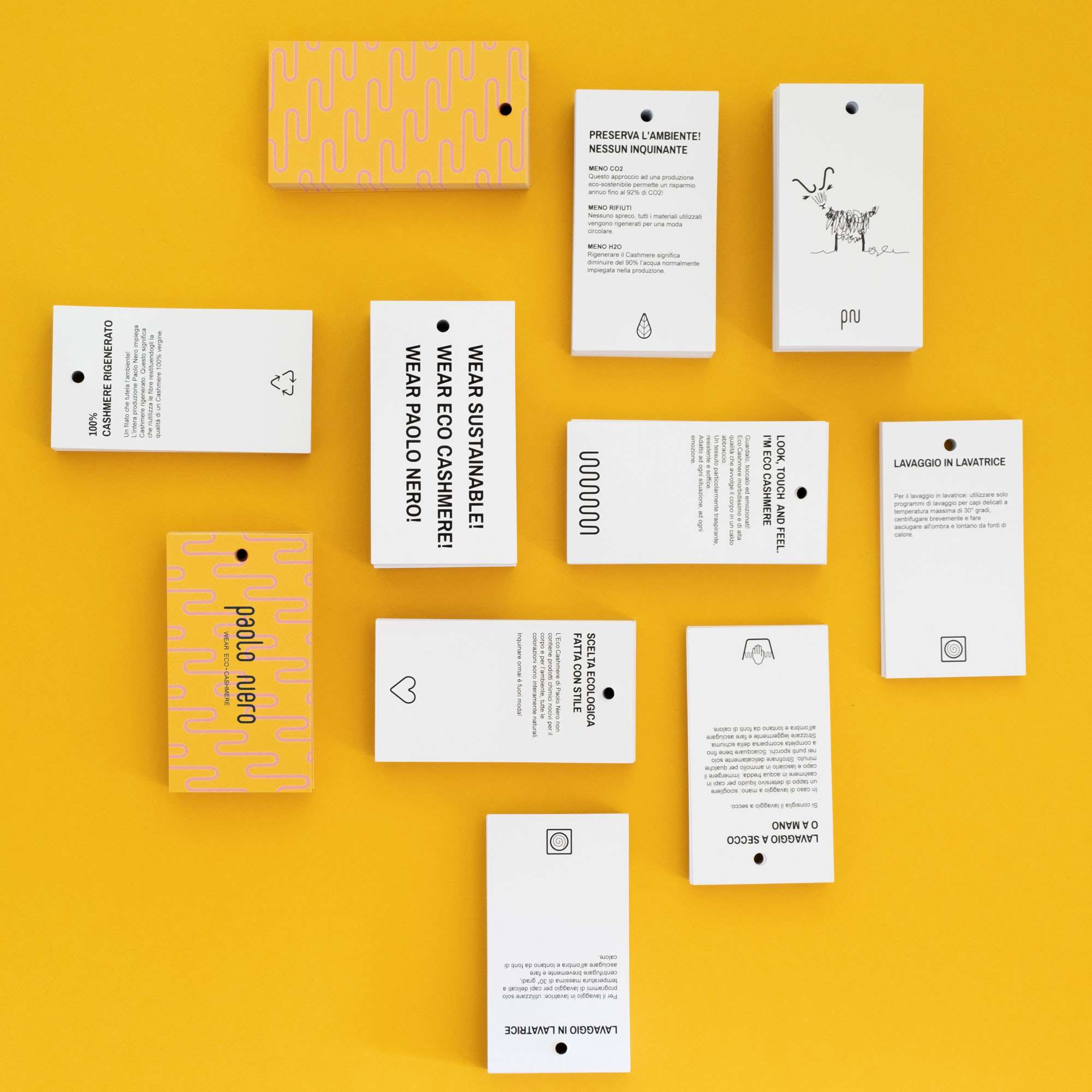
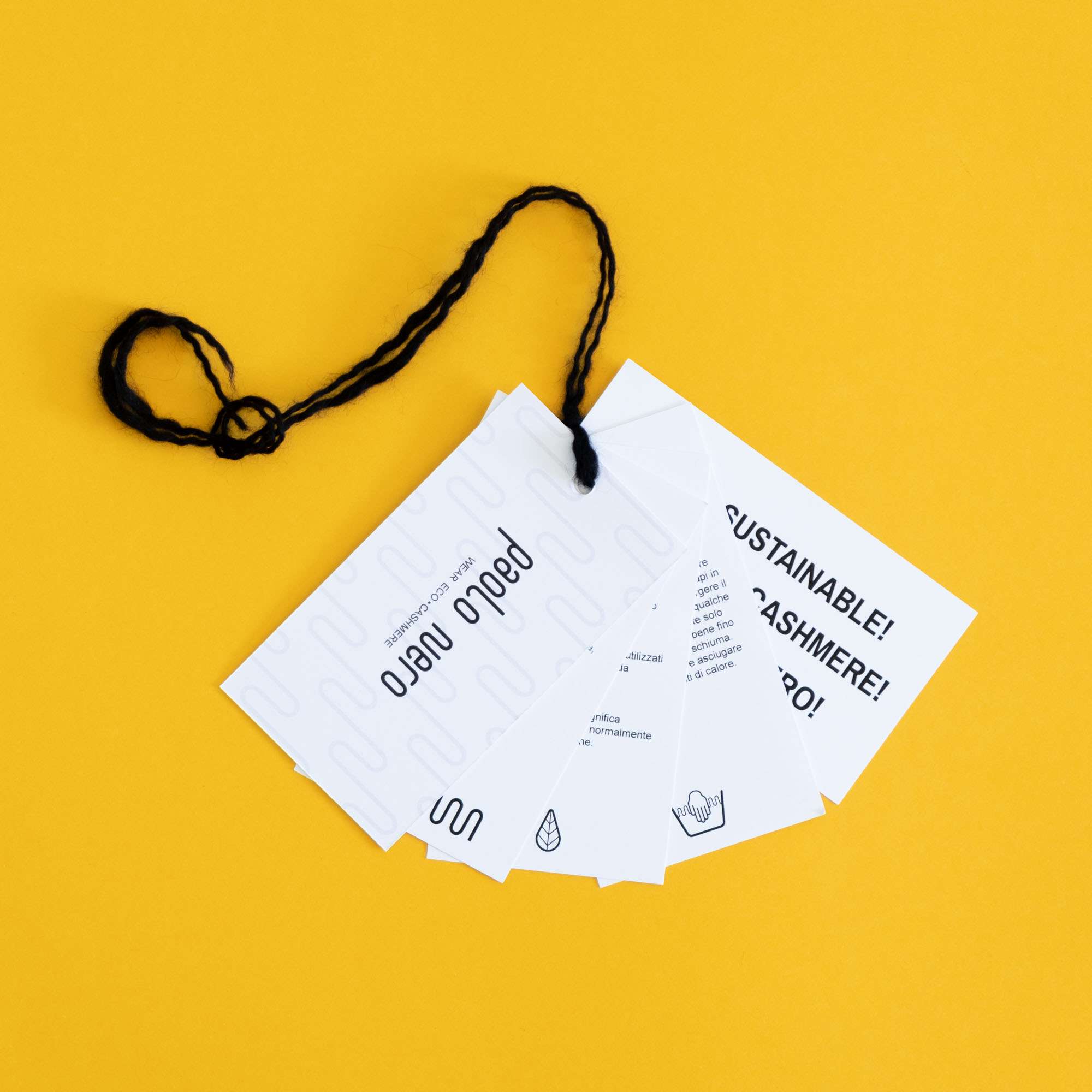
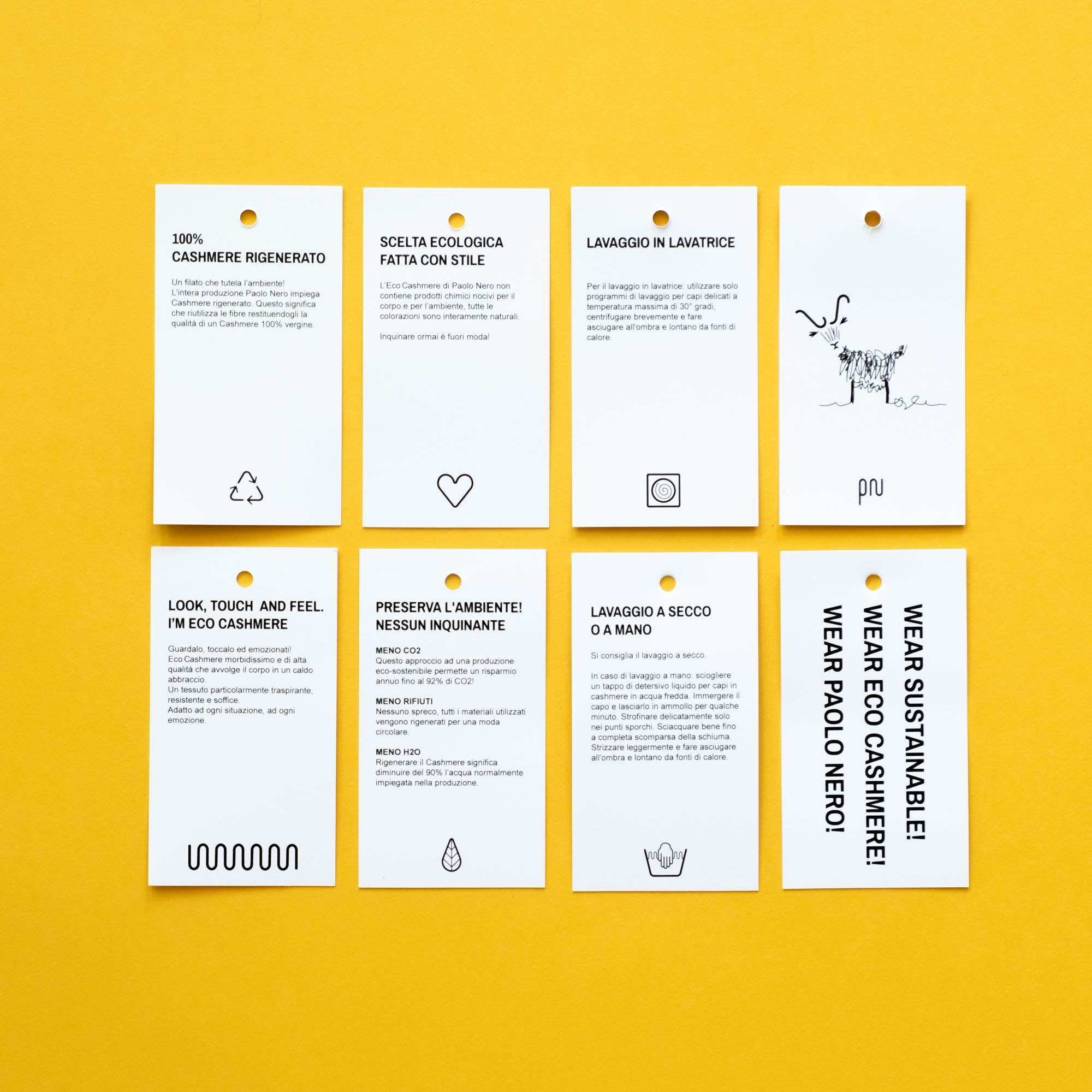
Paolo Nero is an Italian brand of 100% regenerated cashmere knitwear. It respects the environment by reducing the consumption of water and energy needed to work this type of wool. To communicate this process, we cut down infographics to the bone, making it direct and easily recognizable. The logo is inspired by the curved shape of the cashmere goat's horns, the continuous line forms the letters PN but also the entire logotype. Starting from the hardness of the horns, the curve of the logo becomes soft and enveloping, transmitting sweetness but also reliability. The shape of the pictogram recalls a sewing needle with a thread, the starting point of each garment. The packaging and communication tell the story of the natural producers of this precious material: goats. In a playful way we have created short scenes that tell the life of these animals, the stroke of the drawing is composed of a continuous line that becomes the "common thread" of all the brand's communication.