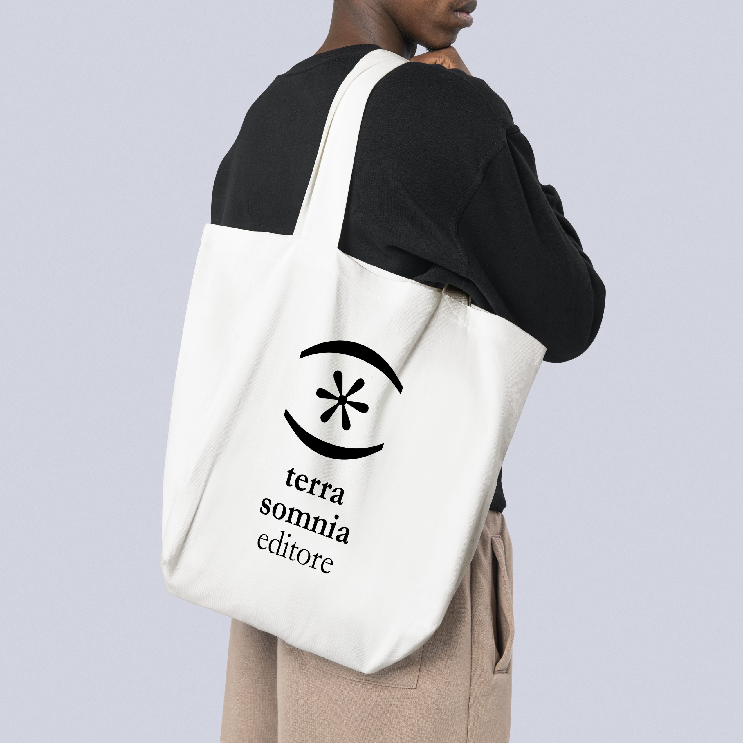
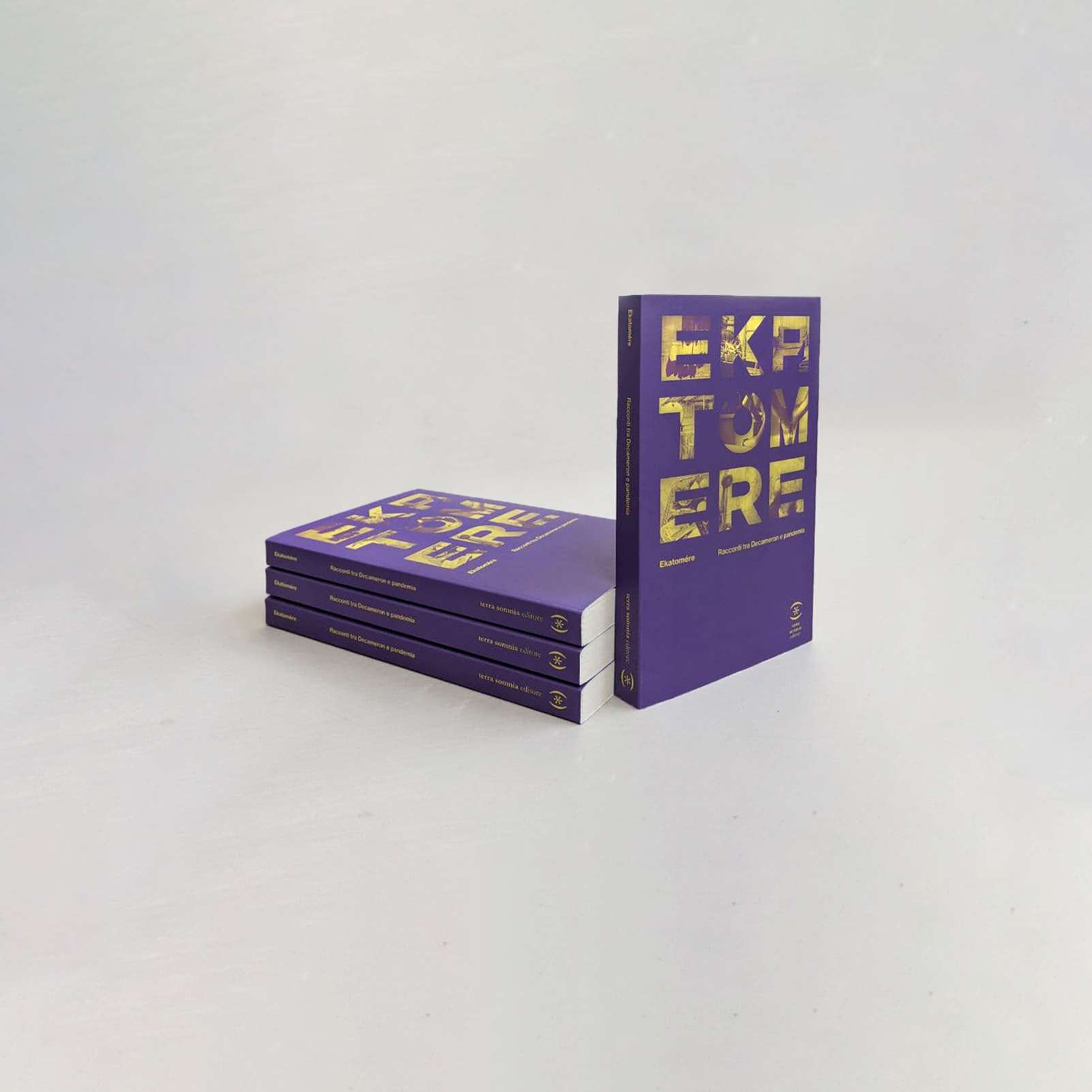
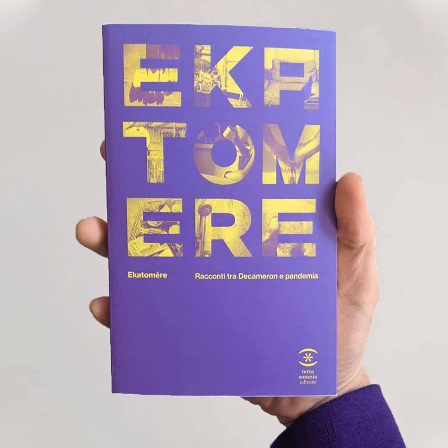
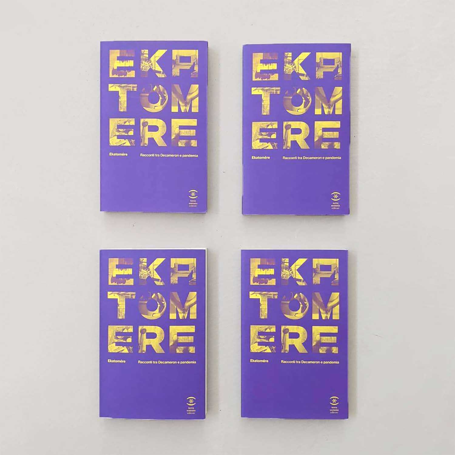
A new colorful identity for Terra Somnia Editore, a young independent publishing house. Fitting, composing and putting letters and words together is the job of a writer or a poet. Here is the concept behind the graphic image of TSE. Designing with letters and graphic signs was our way of paying homage to an emerging publishing house. From the logo to the series pictogram, the language of typographic symbols becomes the leitmotif of Terra Somnia Editore's graphic project.
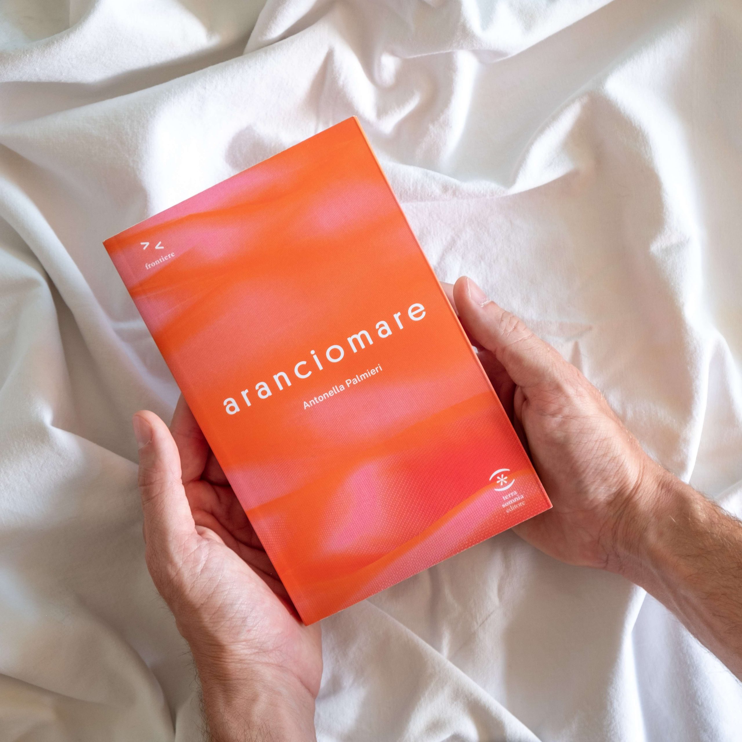
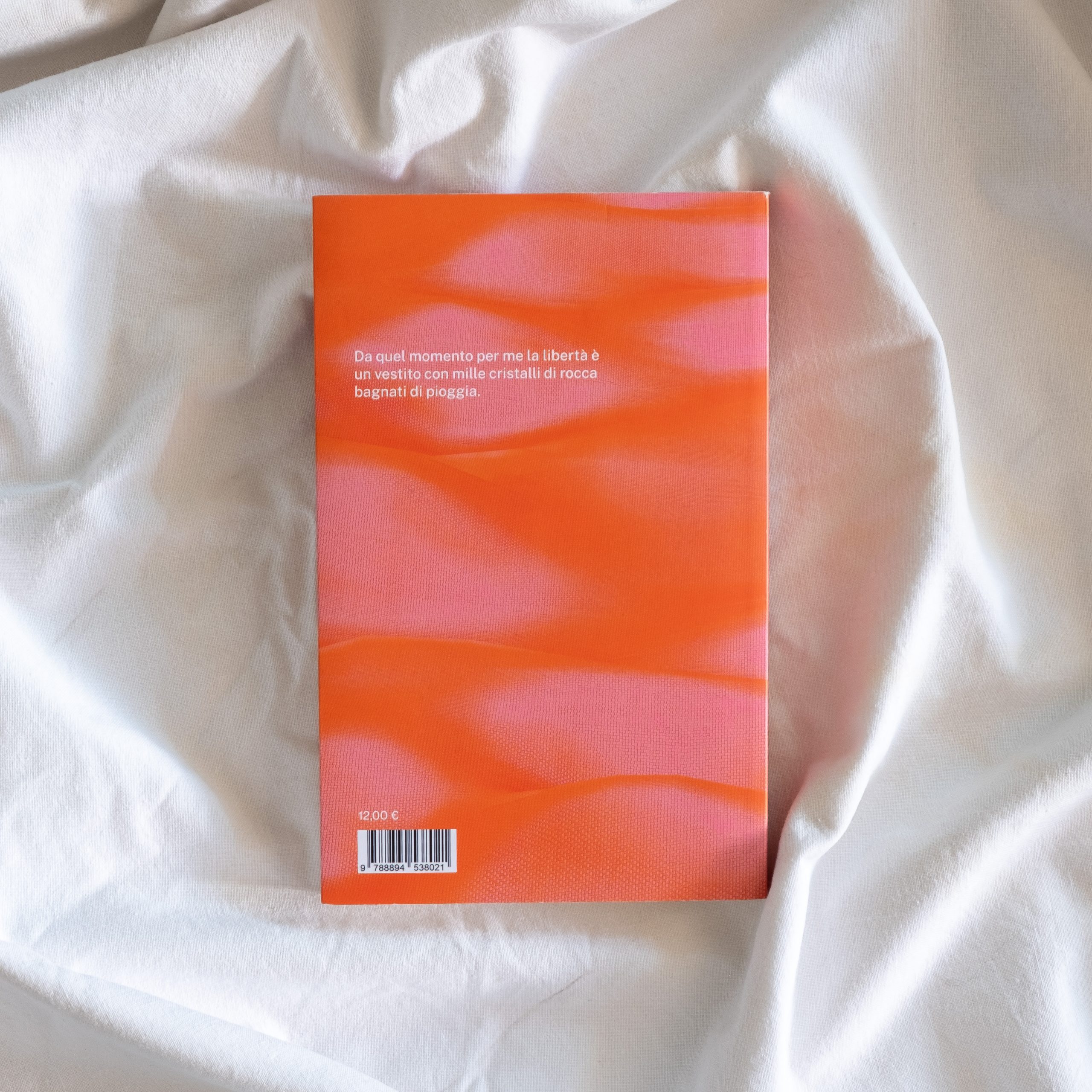
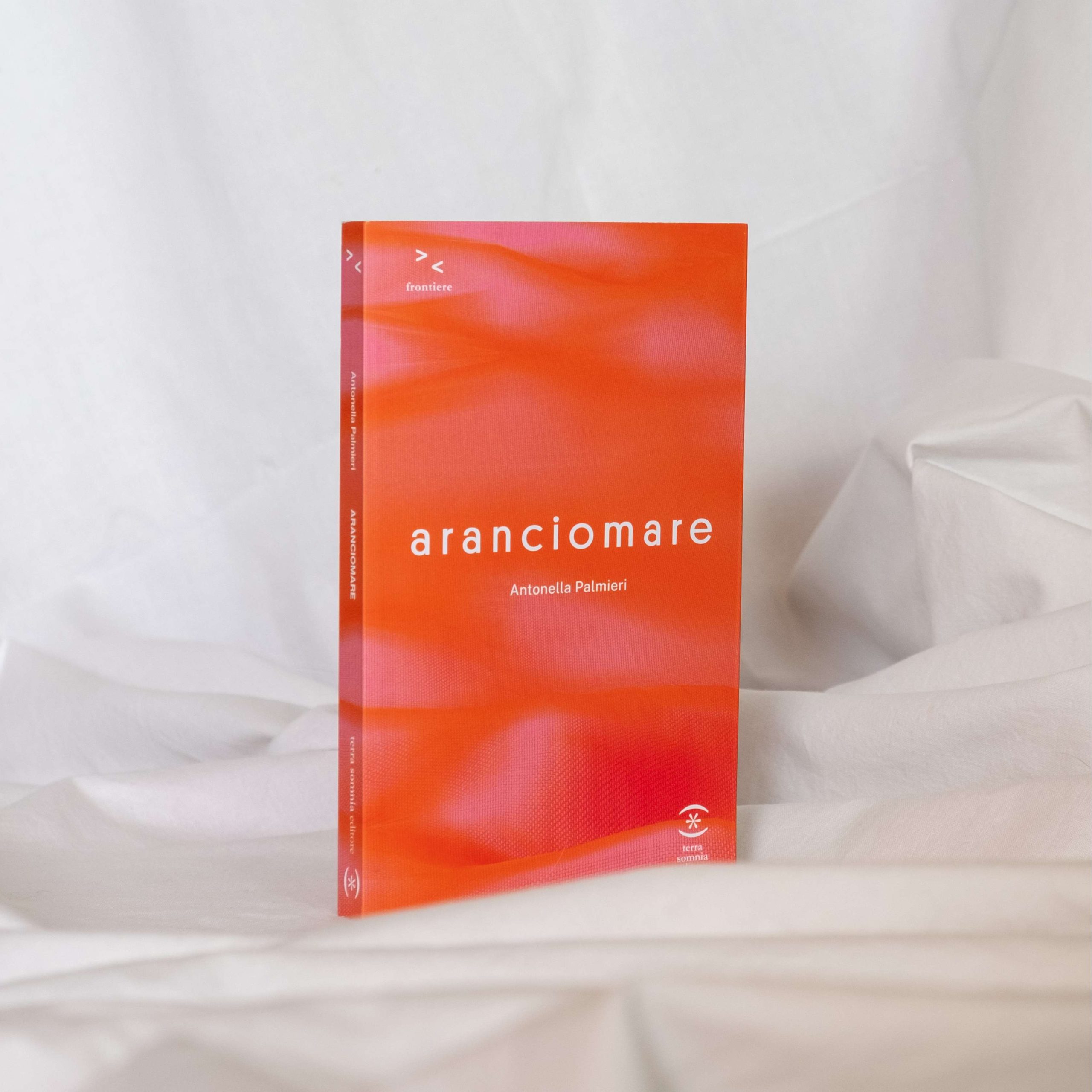
Frontiere > <, series dedicated to fiction. Two elements look at each other and tend to approach without succeeding but without ceasing to try.
Strade //, series dedicated to legality. Two parallel lines, two carriageways, the "straight" way to pursue in the course of one's existence.
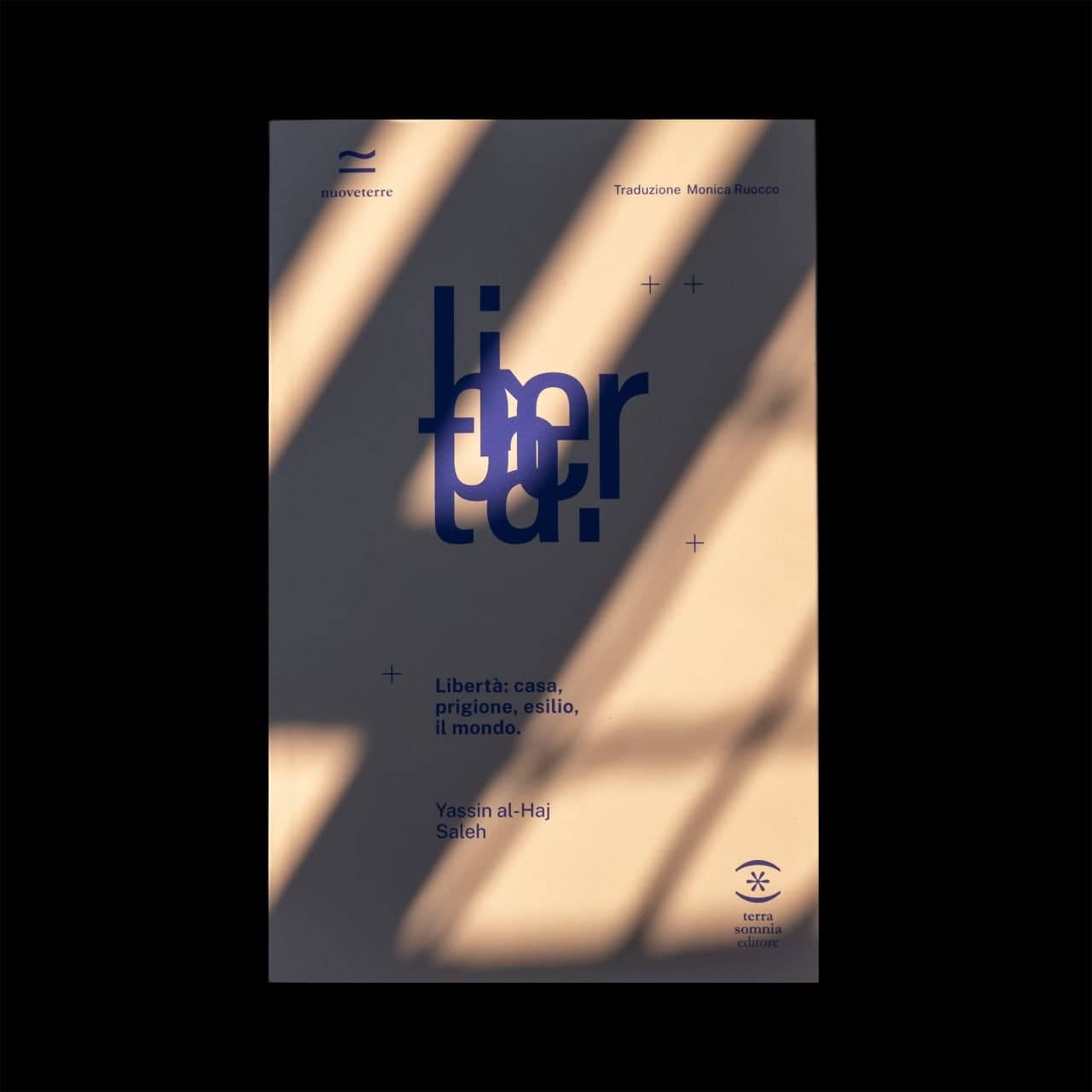
Nuoveterre ≃, series dedicated to foreign authors. The mathematical symbol of approximately indicates a margin of insecurity to face in order to approach other cultures.
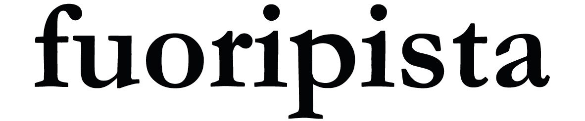
Fuoripista ⊂, container dedicated to off-series products, graphically marked with the inclusion mathematical symbol.
Frontiere > <, collana dedicata alla narrativa. Due elementi si guardano e tendono all’avvicinamento senza riuscirci ma senza smettere di provarci.
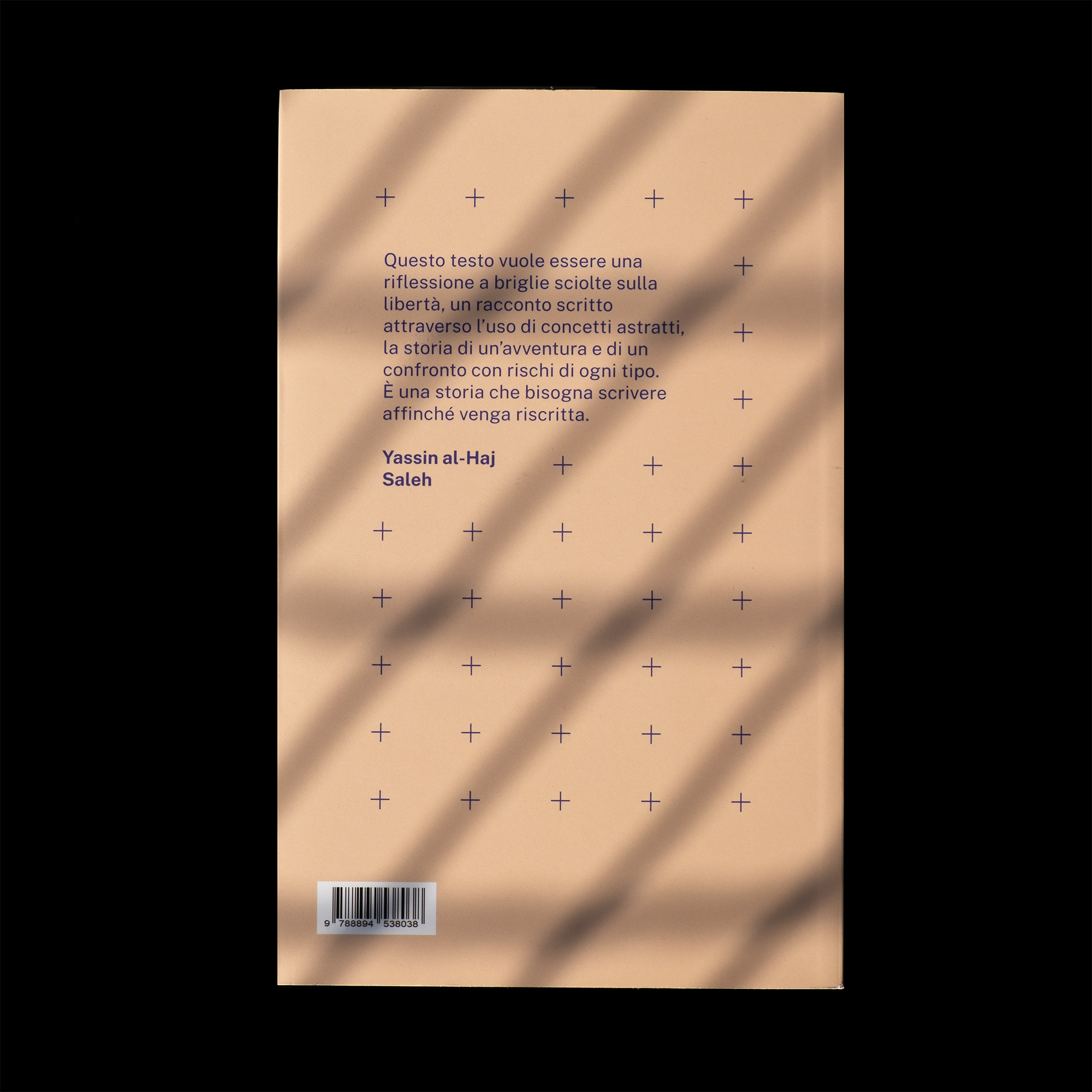
Strade //, collana dedicata alla legalità. Due linee parallele, due carreggiate, la “retta” via da perseguire nel corso della propria esistenza.
Nuoveterre ≃, collana dedicata ad autori stranieri. Il circa matematico, indica un margine di insicurezza da affrontare per approcciarsi a culture altre.
Fuoripista ⊂, contenitore dedicato ai fuori collana graficizzato con il simbolo di inclusione.